
Bhuku Case Study
Context
Bhuku has started collecting data on popular books. Inspired by goodreads.com, they would like to give a more user-centric approach to their app, adding features and flows that make it delightful for people to use.
-
Goals
Design a mobile app that competes with Goodreads and provides a better user experience.
Design Bhuku’s brand.
-
My Role - UX/UI
I was responsible for the whole UX/UI process from research to user testing. The whole project was done in a two-week timeframe.
-
My Process
Research | Define | Design | Test
Research
The first phase of the project began with doing some research to help get a better understanding of the industry, competitors, and users. Some of the methods I used included Competitive Analysis, Provisional Personas, and Interviews.
Provisional Personas
After doing secondary research I was able to create a few Provisional Personas based on my assumptions about book app users.

Competitive Analysis
I looked into other book apps to compare and see how they operate. Looked at all their strengths, weakness, and to see where Bhuku can stand out from the rest.

Interview Findings
I conducted six interviews that lasted 15-25 minutes. Six participants’ ages ranged from 24-55. Interviews were done in various ways. These are some of the patterns I was able to uncover.

Define
Using the results from my research I was able to move into defining who the users were and establishing what the structure of the app was going to be. Some of the methods I used included an Empathy Map, Persona, Site Map, and User Flow.
Empathy Map
Using the information I gathered from the interviews I created an Empathy to drill down on what the insights and needs are for those users.

Persona
From the insights and needs, I uncovered in the Empathy Map I created a Persona to define a Bhuku user.

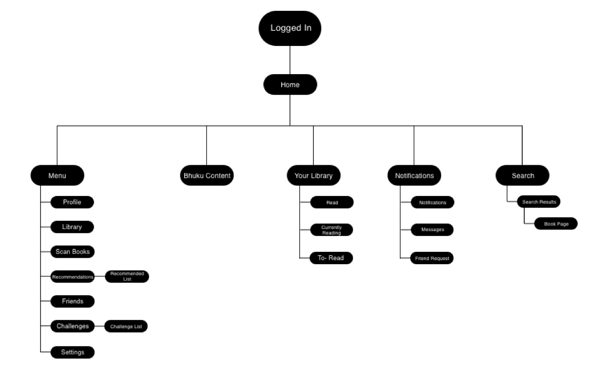
Sitemap
Created a Sitemap after determining the features for the app from my research. I used business goals, user goals, product roadmap, and UI requirements that I created prior to establish what was needed for the app.
User Flow
After creating a sitemap I designed a User Flow with a few entry points to demonstrate how the user would flow through the app.

Design
After establishing who the main user is and what was needed for the app, I moved on to designing the app. I started with Low Fidelity, Mid Fidelity, and High Fidelity Wireframes. Other deliverables included a Style Kit and UI Kit for branding.
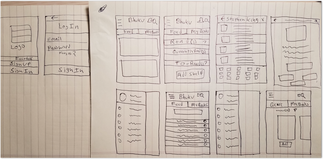
Low Fidelity Wireframes
Began with paper wireframe sketches to help me get an idea of how the structure of the app may look.
Mid Fidelity Wireframes
Using Sketch I designed Mid-Fidelity Wireframes of all the screens that were required for this iteration. I ended up using these to test with users.

High Fidelity Wireframes
I used Dribbble, Behance, and Goodreads for inspiration on the designs. I made some small changes after uncovering some insights from the prototype testing with the Mid Fidelity Wireframes.

Style Tile - UI Kit
Created a style tile to represent the style and feel of the app. Also created a UI Kit for handoff with all the main elements of the app.

Test
Using the Mid Fidelity Wireframes I moved on to testing with actual users. I created a script, used Invision, and was able to gather some users for testing.
Prototype
I created the Prototype using the Mid Fidelity Wireframes in Invison and was able to gather four participants ranging from 23-41.
Affinity Map
Using an Affinity Map I was able to uncover patterns from the prototype test. Finding these similar patterns helped me to understand where the users struggled and succeeded.

Summary
I would improve on my designs and add more features. Testing the high-fidelity screens would be something I would do as well because I changed some of the designs from my mid-fidelity wireframes. Learned a lot from this project, because I had to do everything from scratch. It was challenging coming up with the style and designs for this project.